Thursday 28 March 2013

the wind in the willows characters


i just thought i'd upload all the characters i drew for the wind in the willows book cover as most of them ended up just being decorations in the background!

my favourite ladies


last week i decided to experiment with pencil and watercolour, and after enjoying the results that i achieved, i decided to have a go at creating a set of images within this style. i chose to use some of my favourite ladies as my models, marina diamandis, ellie goulding, zooey deschanel and emma stone, because i have a soft spot for every one of them but also because they're all beautiful, too, and i've found that drawing beautiful people is, for some reason, very enjoyable.


so, there we have it. a 'project' of mine, if you like. hopefully when uni's done with and i'm not a slave to my coursework i'll be able to set myself some more projects and have fun with them!

Wednesday 27 March 2013

the wind in the willows book cover: your opinion?

so since making some minor character adjustments to my book cover, i've come to realise that i'm actually pretty happy with the design overall, meaning i won't be making any further changes to composition/colour/type etc. and just sticking with what i've got (because you can overdo it, right?)

since slightly reillustrating my characters to give them each a little bit more personality by highlighting their general feelings towards toad, i've been told that although the personalities shine through more, the overall vibe that the book gives off is fairly negative because of the expressions of badger and ratty, and may therefore put a reader off.
so, my question for you guys is which book cover do you feel is the most effective? the back page from the top spread will be the one used on whichever front cover i decide to go with, i'm just too lazy right now to create another image for the spread below (sorry!)


it'd be really nice to get some audience feedback on this, because ultimately, it's people like you that i'm targeting while you're walking around a book shop! feel free to comment below or tweet me, i try my best to reply to all comments and tweets that i receive!

thank you!


Tuesday 26 March 2013

late night experiments


lately it seems that i'm at my most active late at night, so tonight i set myself the challenge of painting something using only two colours. i decided to paint myself, for no good reason, just because, and i'm really quite pleased with how this little experiment turned out. definitely a technique i'll revist at some point or another!

Sunday 24 March 2013

the wind in the willows: draft 1

so as i mentioned, this year i wanted to enter the puffin children's book competition just for fun, experience and to prove to myself that i can manage other projects alongside my university projects, and here is (finally) my first draft of the book cover!

i still want to tweak the back page and i'm considering reillustrating the main characters so that they interact better with the entire front cover (this design isn't how i initially planned it to be, but while arranging all my characters/text in photoshop i realised that my original plan wasn't really going to work,) but other than that i'm pretty content with the colour scheme, background and type (which is a first!)


here's the background pattern i created, it simply features some of the characters that the main four characters bump into along the way and i felt it was important to include them in the book cover design because they help influence how the story moves along.

any feedback on how to improve this design would be really appreciated, so if you've any comments at all i'd love to hear them!


Thursday 21 March 2013

something a little different, ft. zoe ldn


today i had a day off from working after spending all day yesterday getting one of my uni projects finished (hurrah for completion!) and went to visit some family with my mum, help her out with the shopping and we ended up going out for a meal spontaneously, too, which was nice. prior to that, i'd been watching a lot of zoe's youtube videos since watching her and lily do one another's make up blindfolded, mainly because i generally find her quite amusing to watch but also because she has such a lovely voice! not something i usually pick out about a person but just go and have a listen and you'll understand. probably. maybe. i don't know, she's just nice to listen to.

anyway, all this watching of zoe's youtube videos made me realise just how vibrant her hair colour is, it stands out from everything, and although i'm not personally a fan of really brightly coloured hair, i couldn't help but feel a bit mesmerised by it because i just couldn't take my eyes off it (mainly because it just wouldn't let me.) all this watching of the mermaid coloured locks inspired me to dig out my watercolours and look at mixing pencil and watercolour to create a contrast similar to zoe's hair and the rest of the (apparently very dull) world.

here was my outcome, it was something a bit different and fun to have a go at and something i might visit again because i think the bright colours against the softness of the pencil works really nicely when trying to create some kind of statement piece that reinforces one part of the image.


Sunday 17 March 2013

a peek into my sketchbook: the wind in the willows

so around october time last year, i was sifting through some university work where i was asked to research into some design competitions and find one that i'd one day like to enter, and during my searching i came across the penguin design award and decided that i'd enjoy entering the puffin children's competition, where you're asked to design the book jacket for a classic penguin children's book.

this year's chosen book was the wind in the willows, a story that i was (surprisingly) unfamiliar with as, as a child, i'd never read the book or even seen the film! i received the book as a christmas present, and although i started reading it in january, i've only just finished reading it today! as soon as i'd finished the book, i also set about watching the film from 1995 just so that i understood the characters and story fully so i knew what i'd be working with when it came to developing a book cover idea.

below are a few peeks into my sketchbook, there's not much to show at the moment because i've only spent a couple of hours sketching so far, but it's a start nonetheless! i'll be sure to keep my blog updated with my progress as and when i make it, hopefully within the next couple of weeks as the competition deadline is very soon and i think it would be beneficial for me to at least attempt to enter, just so i can try to somewhat develop a style, my use of colour, composition and my overall character generation.


all four main characters sketched out roughly in a style that i wished to further develop


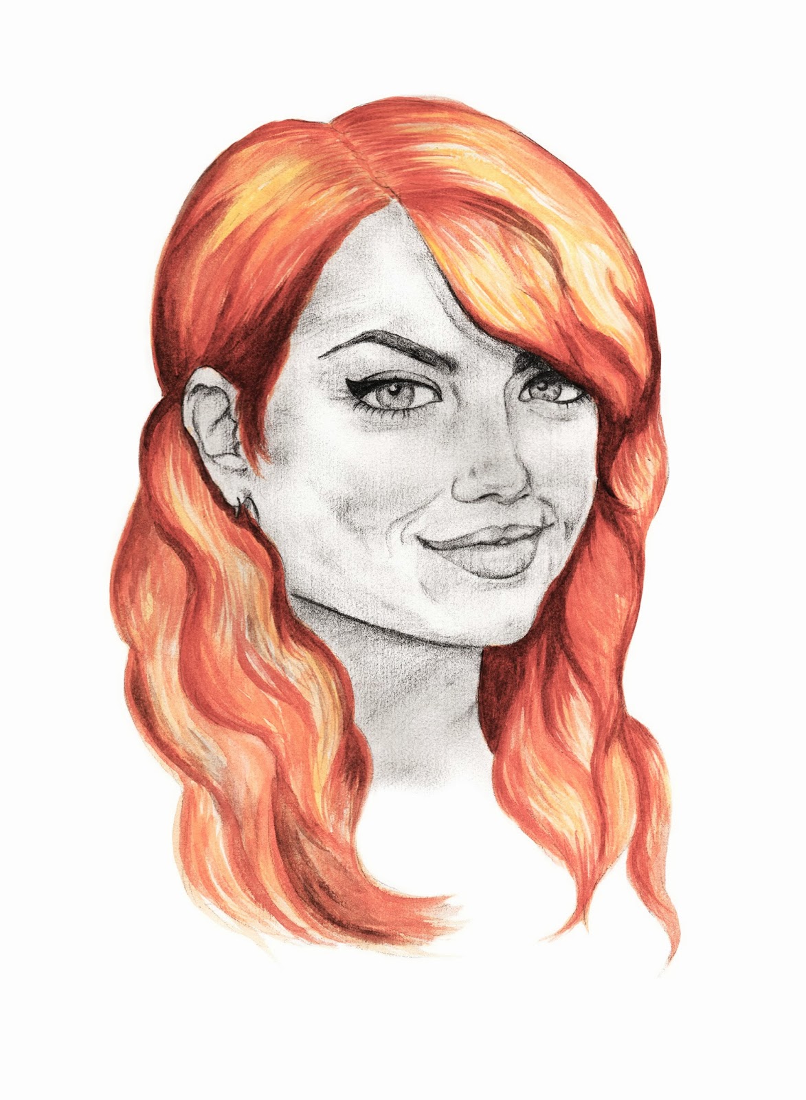
all four characters developed further with my chosen style and with colour added using watercolour, acrylic and fineliner pens

i've got a long way to go in terms of colour application (i'm fairly new to working with acrylics so it was a bit hard to master controlling them exactly as i'd wished, however i did like the texture they helped me to achieve!) and tweaking my overall style, but i think i'm at a good starting point and it should be fairly straightforward to progress further and a lot of fun, too!

i'm setting myself a few deadlines for this week: to have collected and written up all my timeline information formally by monday evening, to develop some ideas and attempt to finalise them by wednesday evening and to have completely finished my timeline by friday evening. by setting these and sticking to them it will ensure that i have an entire week to look at developing and finalising any work for this book cover. fingers crossed i can work efficiently and stick to my plan!

also, don't forget to follow my blog on bloglovin!


Saturday 16 March 2013

motel rocks illustrations


at some point last week i became aware of the competition that motel rocks are currently holding, where entrants are asked to illustrate their favourite motel rocks pieces for the chance to win money to spend online and some arty goodies. i thought "what the hell?" and drew up a few sketches before finalising them into what i've got displayed above.

this isn't a style i've drawn in before, and is probably one i won't revisit again, but it was something different to have a go at and i felt it was appropriate for what it was i was illustrating. i've seen a couple of brilliant entries so far - and although i drew these up for more of 'something to do' rather than because i was interested in entering in an attempt to win - and they've left me feeling a little nervous about entering! i've ten days left to enter, so in that time i think i'm going to decide whether or not i want to enter; half of me says "why not? you've nothing to lose!" and the other half says "if you do enter, it means a few judges might have a few cheap giggles if they don't like what you've done." probably a nasty mindset to possess, but it's one i'm struggling to let go of at the minute.

in other news, i'm now back in barnsley for my 3 week spring break and in that time i intend to finalise some ideas i've had for the wind in the willows book cover, finish my outstanding university project that i should've finished a LONG time ago (oops...) and make a start on my new university project, which sounds very interesting but also scary because we have a measly 4 weeks to get it all done in. 

busy as ever, being a graphic design student is a lot of hard work.


bloglovin?

with all the talk about the GFC crisis floating around various social media sites, i've taken it upon myself to set up a bloglovin' account so i can keep up to date with my favourite blogs, and so you guys can keep up to date with me (if you so wish it!) when whatever inevitable fate finally approaches us.

seriously, i have no idea what's happening, so if anyone would like to clear the air for me, please do!

so...
follow my blog with bloglovin!


Monday 11 March 2013

how me and the pea feel about the snow


i'm just quickly popping by to say a: my mothers' day gift and card went down a treat, and b: it's snowing again here in 'boro (and i'm assuming in most other places of the uk, too) and this time, it's really, really not welcome. at all. by anyone (but especially me.)

so, in celebration of my hatred for the snow, have an illustration depicting how me and the pea feel about the snow: pretty ticked off.


Thursday 7 March 2013

mothers' day preparations


this year mothers' day has managed to creep up on me so i've been left desperately thinking at the last minute of what gift i could get her and have it posted home in time for the day. i considered flowers (but £30 a bunch is just waaay out of my price range,) chocolates (but we've still got a shed load left over from christmas) and bailey's (but she's still got two in the cupboard from christmas), until it hit me that i could send her a personal, unique gift for just the price of a picture frame and postage!

i decided to dig out a photo of me and my mum from when we went down to london for my 18th birthday to watch the lion king in theatre (which was fabulous, by the way) and put my own spin on it. i'm hoping she'll appreciate the gesture, i'd like to think that a few hours of my time and a personal gift beats a box of chocolate or a bunch of flowers that'll die within a couple of weeks, but who knows. i suppose i'll find out on the day when she's received the gift!

as well as the framed illustration, i also designed a personal card for her. the two little piggies are me and my brother and the biggest piggy is my mum, the whole piggies idea spirals from my mum's fondness of piggins, but also because she enjoys calling me her little pig and making the occasional hilarious joke about me eating bacon being cannibalism, etc. etc.

i meant to take photographs of the framed illustration and the printed card, but me being forgetful and in a rush to get things posted on time forgot to do so, d'oh, so i'm hoping the original design/scan will make do!